Family Portrait in Helvetica. Installation, 2014. Teor/éTica, San José, Costa Rica, 2014. Más Allá el Mar Canta, Times Art Center, Berlin, Germany, 2021.

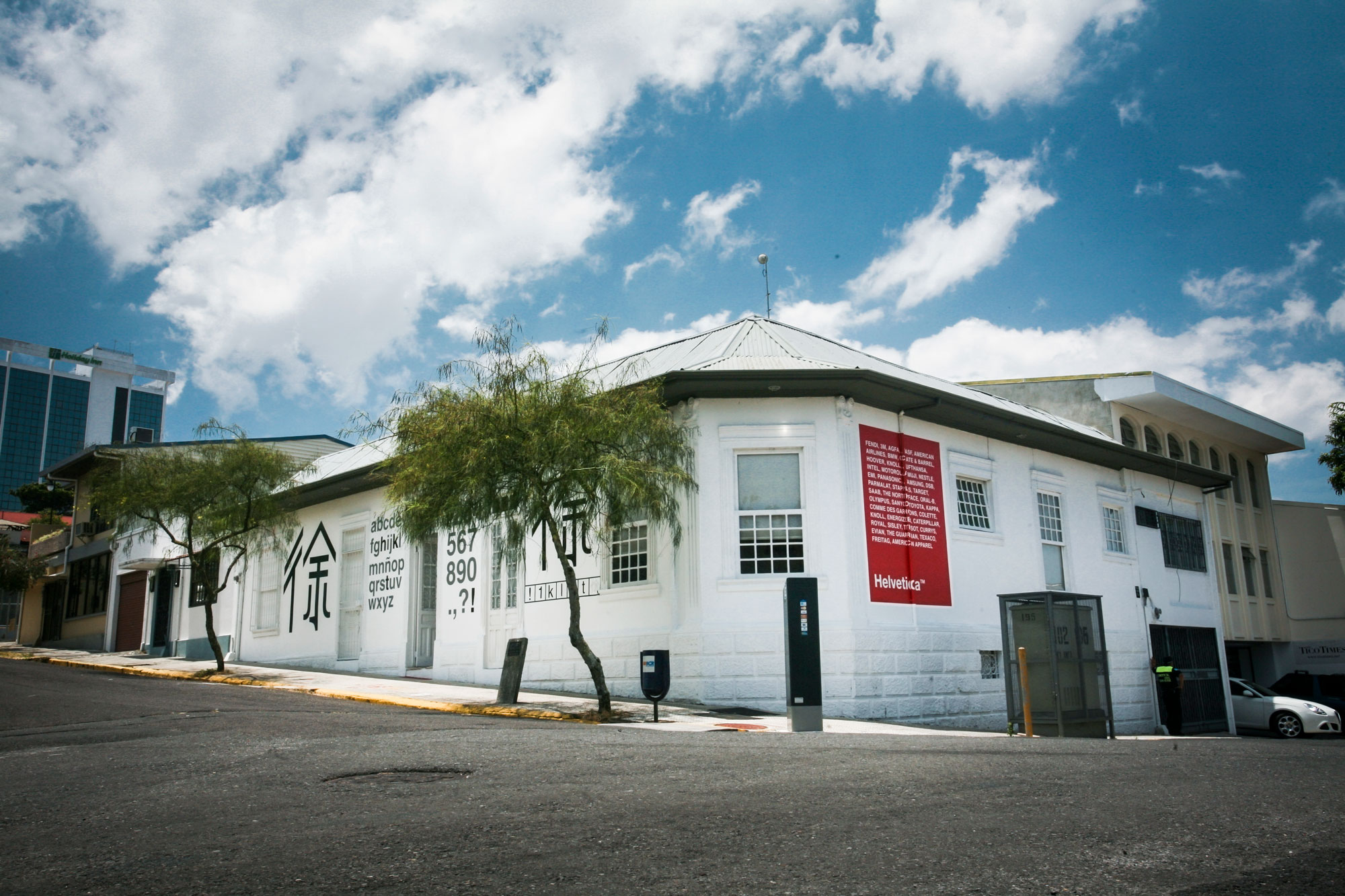
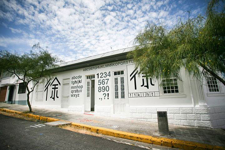
Mimian Hsu (1980, Costa Rica) has been invited to intervene TEOR/éTica’s façade as part of her project Family Portrait in Helvetica, 2014. The display of certain of her previous pieces and a new series of photographs related to Chinese immigration in Costa Rica will accompany the exhibition.
For the façade, Hsu (of Taiwanese descent) has created a design chart where she displays the ways in which fragments of letters and numbers, typed in Helvetica font, can been used to write the artists’ name in Chinese characters. What may appear to be the coming together of two different systems of representation, results in a peculiar form of cultural hybridity.
Fonts, typography, the aesthetic appearance of letters, are the most immediate forms of design that we face daily, from the use of keyboards and screens, to publicity’s constant bombardment of written messages. The style of a font embodies affection, emotions and ideology. Designers, publicists and artists comprehend the power a letter’s style has over a person’s subjectivity. This awareness of the font’s effect can be traced within art history itself, in text based conceptualist practices.
For example, Joseph Kosuth’s mythical pieces on the tautologies about the representation of objects, would not have been assimilated in the same manner if the font of the words that appear in his works had been done using a more baroque, gestural style of writing. The visual “neutrality” in the type of font used in conceptualist strategies like Kosuth’s derives from the cultural identification that the West has given to certain typography which is assimilated as being aseptic, sterile, hygienic and therefore, universal.
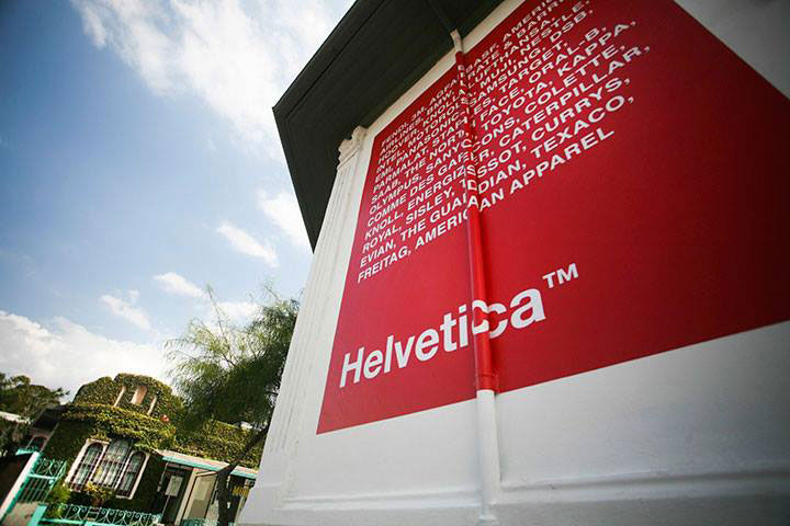
The “hygiene” of a font like Helvetica motivated Hsu to question its homogenizing power within design. In the large-scale Chinese character that appears on the left of the façade, the western modern letters and numbers in Helvetica have been modified, almost forced, to adapt to an East Asian, gestural type of writing. With her work, Hsu appears to have created a fictitious typography, pointing out the limits of cultural translation within a so-called universal design, one which Helvetica claims to represent. It is important to note that Helvetica font in itself has assumed a unifying role within global economy, making it the preferred style of several corporate brands. Some of which are listed in the intervened façade.
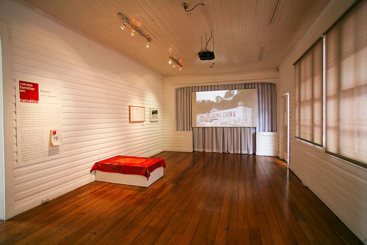
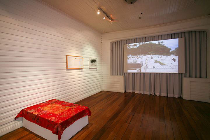
Meanwhile, the works in the exhibition room belong to the artist’s body of work that explores historical interstices related to the flow of Chinese immigration to Costa Rica, one of the most significant in Latin America.
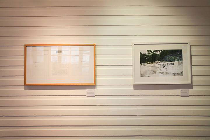
For example, her work Colonia China (2014), documents the ghettoized Chinese cemetery in the Caribbean side of the country. While No.1674, Sección Administrativa, Versión 2 (2006) is an installation based on a letter written in 1907 by Chinese railway workers who were asking the Costa Rican government for a permit to bring their wives and children to the country. The work is comprised by the letter’s text embroidered on to a chinoiserie bed sheet silk, often given as a gift to newlyweds.
Inti Guerrero
Curator